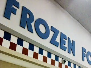
Super Fresh circa 1984...
Acme Checkerboard Arch Decor…


The SAME exact font in both stores! It's most obvious when you compare the arms of the F's and E's. John, aka JSF0864, posted some spectacular photos of the Willingboro Super Fresh in his flickr collection. I did a double take when I saw the department signs on the walls. I compared them to the the signs at the Manasquan Acme and discovered they were an exact match! The letters can also be seen in the Seal Isle City store by clicking here.
Below is another shot from the Willingoboro Super Fresh circa 1984. John has even MORE posted in his flickr collection. The shot of the plant and produce department is a must-see! Click on the pictures below to jump over to John's photosream to see more.